For my music video, I chose the song Kids by the indie/rock band (with elements of psychedelic rock) MGMT. The band is not a mainstream artist and does not already have an established music video to this song. I chose the song as I was inspired by music videos such as Young Blood by The Naked and Famous and Shuffle by Bombay Bicycle Club as they display elements of real life and youth culture. I felt the song I chose was at a fast enough pace to do something similar, as I thought being able to represent the indie/rock target audience was important as they could relate to themseleves in the video. I planned to create an abstract video, with only small elements of continuity, as the song was not appropriate for any significant performance in the form of dance sequences or miming and I was much more interested in creating a video which was able to represent something significant to its intended audience, rather than promoting the artist. Additionally, I felt a performance-based video was more typical of the R&B/Pop genre of music, so by doing so in my video it would not fit the codes and conventions of the indie/rock genre effectively.
One of the codes and conventions of music videos in the indie/rock genre is to usually try and express ‘real life’ either in a way that the audience can relate to, or in an unusual sense to attract and entice the audience. For example, in The Naked and Famous’ video of Young Blood, their intention is clear; they are attempting to portray the freedom of the teenage generation and the recklessness of teen spirit. This is something I thought was important to portray in my own music video, as this carelessness is something that I feel represents the teenage youth (particularly those who are interested in the indie/rock genre).
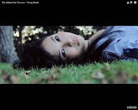
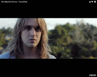 For example, in this video, numerous characters are featured
– both males and females of a young age to successfully represent its audience.
For example, in this video, numerous characters are featured
– both males and females of a young age to successfully represent its audience.This is something I tried to include in my video as by including numerous male and female characters it ensured that my video could appeal to a larger audience. Additionally, I thought it was important for the costume of my characters to be able to represent the style of my target audience, so I carefully made sure outfits were not the same as each other but represented the ‘typical’ indie/rock teenager’s dress code. This mainly consisted of bright colours, numerous materials and trainers/plimsolls to create a relaxed, grunge feel.
Adding to the mise en scene, I chose Hessle Foreshore as the prime location for my video, as this enabled a vast amount of space to create a variety of different action shots as well as having different elements of location in one place; the forest, the park, the lake, the river, the trails etc, so was fitting to capture all of the action I had planned to try and represent teenagers (climbing trees, running in large spaces, jumping, roller skating etc). However, I did find that the distance between my house and the location (around 40 minutes drive) made it difficult to organise any re-shoots as it usually took an entire day to arrive, shoot everything and get back again. It was also difficult to try and get more than one of my characters available on the same day to make the trip to film re-shoots more worth-while , as filming one character at a time in this location on separate days would have been too time consuming.
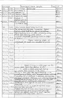
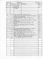 Overall, I filmed all of my
footage on 7 separate occasions, from October 2012 to February 2013,
accumulating around 10 hours of footage approximately.
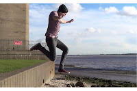
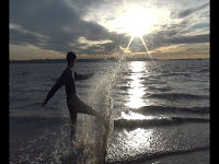
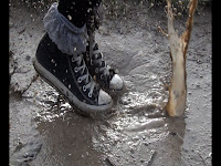 With the activities that I designed for my characters to take part in, the
intention was for it to look as fast-paced and care free as possible, as I was
trying to illustrate the fun, reckless and care free life of a typical
indie/rock teenager – therefore trying to effectively represent them in my
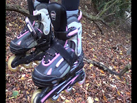
video and for them to be able to relate to my video’s content. Some examples of the activites I planned for them to do was jumping from high heights, climbing trees, jumping in puddles, playing with sparklers etc. The part I found difficult here was making sure all the activities looked varied without repeating anything and trying to make sure every shot looked fast-paced and interesting. However, the extensive planning I did before I actually started filming my shots greatly helped with this.
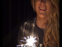 This is something I found was similar to The Naked and Famous’
video of Young Blood; in every clip they put together, it displayed something visually significant which keeps the viewers interested in its content.
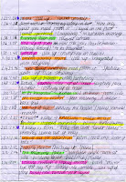
This is something I found was similar to The Naked and Famous’
video of Young Blood; in every clip they put together, it displayed something visually significant which keeps the viewers interested in its content.The part I found difficult in the creation of my own video was ensuring that the action was equally shared out between my characters, so I labelled characters from A-E (E being split into two characters) and color coded them to fit with the storyboard and planning, to make sure the finished product looked varied and even.
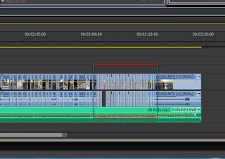
 Another convention of indie/rock music videos, or music videos in general,
is for the content to be edited in time with the music. This ensures that the
content of the video follows the song effectively, and is something I made sure
I did in my video. I think this is particularly effective in the last section
of my video with the extremely short clips to match the increasing beat of
the song , adding to the fast paced effect I wanted to create. This is something I have attempted to demonstrate below.
As well as this, I
wanted to make sure each of clips weren't too long as to bore the viewer, as I
was conscious that without having any strong element of performance in the form
of dance or lip syncing, keeping the viewers interested was going to be a challenge. Adding to this, I didn't want every single shot to be framed perfectly in the screen (some shots being purposefully askew or not directly in shot) as I thought this would add to the 'careless' ideology I was trying to represent as by making some shots look slightly rough, I feel it is able to connect with the teenage target audience much more effectively.
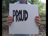
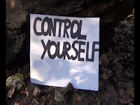 However, I did feature some element of performance in my video by using boards with some song lyrics drawn on.
I felt this added to the ‘teenage’ ideology I was trying to represent, as I felt it signified a creative aspect (being hand-drawn) and added a more personal touch to my video as well as reinforcing the idea that my artist is less mainstream with the boards being roughly hand drawn. I also thought it would help the audience become more connected with the video’s content, as it enabled them to view the lyrics physically in different settings. Personally, I feel the lyrics link with the content of my video successfully; the main lyric being ‘Control yourself. Take only what you need from it” which suggests taking only what you need from life as things don’t last forever so it is important to make the most of life while you can. This may coincide with the ‘teenage’ ideology that I was trying to represent; taking all the opportunities that life offers whilst young.
Originally, I got this idea from Bob Dylan’s music video of Subterranean Homesick Blues as this demonstrates an artist using boards to illustrate lyrics visually to the audience. I feel that by doing this, Bob Dylan breaks the conventions of music videos during this time without a traditional element of performance, helping the audience become more involved with the meaning behind the lyrics as they actively read from the screen.

 However, I did feature some element of performance in my video by using boards with some song lyrics drawn on.
 I felt this added to the ‘teenage’ ideology I was trying to represent, as I felt it signified a creative aspect (being hand-drawn) and added a more personal touch to my video as well as reinforcing the idea that my artist is less mainstream with the boards being roughly hand drawn. I also thought it would help the audience become more connected with the video’s content, as it enabled them to view the lyrics physically in different settings. Personally, I feel the lyrics link with the content of my video successfully; the main lyric being ‘Control yourself. Take only what you need from it” which suggests taking only what you need from life as things don’t last forever so it is important to make the most of life while you can. This may coincide with the ‘teenage’ ideology that I was trying to represent; taking all the opportunities that life offers whilst young.
Originally, I got this idea from Bob Dylan’s music video of Subterranean Homesick Blues as this demonstrates an artist using boards to illustrate lyrics visually to the audience. I feel that by doing this, Bob Dylan breaks the conventions of music videos during this time without a traditional element of performance, helping the audience become more involved with the meaning behind the lyrics as they actively read from the screen.
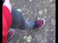
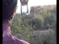
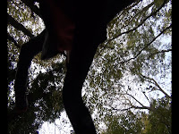 Additionally, it is important to have varied camera shots to keep the audience entertained, which is something I made sure I did in my video. There are numerous close-ups, extreme close-ups, low angles, high angles, pans and tracking shots as a way of entertaining the audience as well as making sure the content looked varied and experimental, as by including many different types of camera angles it illustrated the action in different ways for the viewer. I also wanted to make the viewers feel partially involved with the action that was being displayed in the video, as I thought this would help them relate to the content of the video. Being 3 minutes 30 seconds long, I thought varying the camera shots was important to make sure the audience were kept interested throughout. For example, in shots such as the ones displayed below, it looks as if the camera is acting as the audience by being involved with the action and displaying it from their point of view. Their relation to the video is also reinforced by the fact that it is teenagers that are displaying the action, helping them relate in terms of age and interests.
As something extra, I decided to make a second video displaying the outtakes from my main video, as I thought this would enable the audience to see some shots that didn't work as well as I’d hoped, so the reason behind some of my re-shoots, as well as displaying the fun I had whilst creating my video. Although this isn't contributing to my final products, I feel it naturally displays the ‘carefree’ teenage ideology that I intended to create in my video, so adds to the overall ideology that I was trying to represent. To create the outtakes video, I used the same editing tool on the editing suite (Adobe Premier Pro CS6) and ensured some form of continuity by using the same artist as I used in my music video, so staying within the same genre. To create the ending, I had to continuously crop the song in order to extend it so it was able to cover the entirety of the video without moving to a new verse in the song. This was something I found difficult but was happy with the end result.
How effective is the combination of your main product and ancillary texts?
To create my ancillary texts, I first took plenty of images of one of the characters that featured in my music video (to ensure continuity) and uploaded them onto my computer to view them. I tried out numerous different styles within the images to make sure I had a lot to choose from, including writing in the snow, jumping, kicking snow, spinning, climbing. After sorting through the images I thought I could use for my advert and digipak, I began editing the images using Adobe Photoshop CS5 to ensure the image looked vibrant and crisp. The image I chose for my advert was the one of my sister Chloe (who also featured in my video) with her head tipped back and her arms in the air.
To create my ancillary texts, I first took plenty of images of one of the characters that featured in my music video (to ensure continuity) and uploaded them onto my computer to view them. I tried out numerous different styles within the images to make sure I had a lot to choose from, including writing in the snow, jumping, kicking snow, spinning, climbing. After sorting through the images I thought I could use for my advert and digipak, I began editing the images using Adobe Photoshop CS5 to ensure the image looked vibrant and crisp. The image I chose for my advert was the one of my sister Chloe (who also featured in my video) with her head tipped back and her arms in the air.
I felt this looked the most effective for my advert as I felt she
looked carefree and displayed an element of freedom, which was something I felt I created in my music
video, therefore again attempting to link my advert and video together.
Before editing After editing
I then
began experimenting with many different text styles for my advert, as well as
experimenting with different artist and album names, which I thought I showed
through the development process. I was trying to establish the most effective position for my artist name without it looking too cluttered. Originally, I didn't want the album name to be featured on my advert as I wanted to keep it as simplistic and clear to the audience as possible, but decided as this is a large convention of magazine adverts, the best idea would be to include this to make it look as realistic as possible and for it to have the greatest impact on the audience.
I settled on the name ‘The Reckless’ as I thought
this reflected the ideology I was trying to create with my artist and video as
a whole and looked realistic, however I did find creating a new artist name
difficult as I loved how the original artist name ‘MGMT’ looked on the page,
but thought creating a new identity was important. I named the album after the
first track on the album, as well as the track name that my music video was
based on (Kids), as I thought this was one convention that was often done with albums
and I also thought it looked effective on my advert. Interestingly, I also thought this name reflected the characters featured in my video which further represented the ideology I was trying to create, and again linking both pieces together.
I then set about creating some form of website information for the audience to be able to contact to buy the album. I added the artist's personal website onto the advert, and then began to create a simulacrum of the Amazon website logo, as I thought creating my own was important instead of simply copying the logo for my advert from the Amazon website. I also thought putting a well-known website on the advert would make it look more realistic and professional overall. I managed to do this in one media lesson, but found finding the perfect font for both parts difficult to make it as similar to the original logo as possible. However, on reflection, I feel this looks realistic and effective on my advert.
I then set about creating some form of website information for the audience to be able to contact to buy the album. I added the artist's personal website onto the advert, and then began to create a simulacrum of the Amazon website logo, as I thought creating my own was important instead of simply copying the logo for my advert from the Amazon website. I also thought putting a well-known website on the advert would make it look more realistic and professional overall. I managed to do this in one media lesson, but found finding the perfect font for both parts difficult to make it as similar to the original logo as possible. However, on reflection, I feel this looks realistic and effective on my advert.
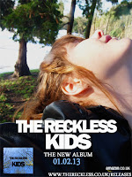
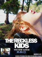 I then also decided to add a small image
of my album cover onto my advert; I first began experimenting with the front
cover as I thought continuity was a convention in both pieces and by displaying
a similar image on both, I thought this would look effective and create a
connection with both texts. However, in the end I decided to go with the front
cover album image I originally had, (the blue sky) as I thought it linked the color scheme
together and looked more striking on my advert. I also thought that by
including the album’s image on my advert, it would ensure the audience knew what
it looked like, and so making it easier for them to purchase.
 Overall, I wanted to make sure my advert and video linked in the form of the ideology I was trying to create as well as with the abstract feel I’d created within my video – shown with the open pose I’d instructed my model to do representing freedom and teen spirit, as well as the background behind the model (forestry) representing the careless and reckless nature with a similar use of setting I used in my video, linking my video and advert together.
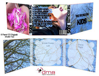
To create my digipak, I decided to mix the images I had taken (at the same time as my advert photos) with snapshots taken from my video, as I thought some of my shots were visually attractive so would work as still pieces. The image on the right of the flower petals was the only image I decided to use from my actual video in the final draft. However, in the development process there is evidence of me experimenting with many other snapshots from my actual video.
I then began
experimenting with the different layouts of images onto the template using
Adobe Photoshop CS5 as well as different styles of font and their positioning.
Using the images of the blue sky I had taken, I got the visual effect of the
back panel by altering the opacity
of these images inside the disks to create a more transparent effect.
The aspect of creating the digipak I found the most difficult was trying to ensure all the images linked together effectively on each panel as I thought it was important for the digipak as a whole to fit together nicely. As well as all of the individual images linking together, I had to try and make sure the digipak as a whole linked effectively with my advert and video, so I used the same light blue color scheme through both pieces to achieve this. I feel the light blue colour was an effective colour to use through both pieces as I feel it represents freedom with the idea of open space and so corresponds with the idea behind the content of my music video. This carelessness and freedom was something I tried to represent in the cover of my digipak (being the first thing the audience will see when buying) as I feel with the camera pointing up into the blue sky, it represents the careless ideology of teenagers with the open blue sky representing freedom, therefore being a symbol for their careless, reckless nature as to appear as if they are looking up at the sky. This is something I tried to reflect in my magazine advert; the model is looking up into the sky to reflect the freedom and carelessness of the target audience.
 I also thought it was important to portray both my magazine advert and digipak
in a real life setting. To do this, I edited my album panels into a life-sized
3D image of a digipak as well as editing the album cover onto the popular
digital media application iTunes. I figured iTunes was to be the most popular
way my target audience would access digital music, so would be helpful to see
the album as if being played by a teenager, to see how realistic it would look. Overall, I think my digipak looks effective placed into real life settings.
I also thought it was important to portray both my magazine advert and digipak
in a real life setting. To do this, I edited my album panels into a life-sized
3D image of a digipak as well as editing the album cover onto the popular
digital media application iTunes. I figured iTunes was to be the most popular
way my target audience would access digital music, so would be helpful to see
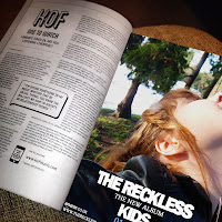
the album as if being played by a teenager, to see how realistic it would look. Overall, I think my digipak looks effective placed into real life settings.In a similar way, I edited my music magazine advert as a JPEG image using Photoshop onto an open magazine, as this is the way it would be viewed. I thought it was important to be able to view my advert as it would be displayed in a real magazine, as it then gives me some idea how effective it would look to my audience. Overall, I feel my advert looks effective placed in an open magazine as the image dominates the whole page just as I intended, and the font is large and clear so the readers can be aware of the adverts intentionally immediately. The magazine I chose to feature my advert in was the music magazine NME, as it often advertises artists of the indie-rock genre as well as often advertising new, less mainstream artisits, so I thought this would be the magazine that my aritst would most likely feature in in the real world. However, I also discovered that to post a full-page advert in a magazine, it would be very costly to the artist. With my artist intended to be less mainstream, this is something I may have to consider further as it is unlikely that they would be able to afford an entire full-page spread advertising their new album.
What have you learned from your audience feedback?
From this feedback, I have learnt that to the majority of my audience, my video fits the conventions of an indie/rock music video with its alternative and quirky feel; established with the lack of any performance and with the fast-paced action. I learnt the majority of the people I asked thought my video was trying to portray the freedom and carelessness of youth as well as the title of the song ('Kids') with the age of the characters and the action that they were taking part in. I learnt that the majority of the people I asked felt the ancillary texts looked effective and linked to the music video with the same female featured on the advert as in the video, and the pose being typical to advertise a non-mainstream artist - by not giving eye contact to the camera she is instantly viewed as rebellious by the audience, therefore fitting with what is expected from the indie/rock genre.
To improve my video, from the audience feedback I have learnt that I could possibly have used a better quality camera in order to improve the quality of the footage. I could have also used contrasting locations, instead of keeping the basis of my footage within the same mise en scene, as this would possibly add more depth to the video.
Adding to this, I personally think that my video could be more-fast paced, particularly with the number cards at the beginning as they look more like still images rather than footage. One member of my target audience that I questioned also commented on the fact that I could have included some more small elements of performance in my video, such as having some characters mime a significant line of the lyrics. However, I do acknowledge that in my first edit I did include some elements of mime to try and mix elements of abstract and performance together, and thought it didn't look as effective as I'd hoped, so removed it from my next edit.
To improve my ancillary texts, from the audience feedback I have learnt that I could possibly improve my choice of images - particularly on my digipak - as one comment from the feedback was that they didn't feel the petals linked with the other images/content from my music video effectively. This could be something I could reconsider to improve my digipak so that it is able to connect with my target audience more effectively.
One comment I received to improve my advert was concerning the image of the album cover. Being too far to the right hand side, they said it looked unusual and should be moved into a larger space so that larger gaps could be left either side to frame it. Although this is only a minor improvement, it is a starting point to make my advert look more effective. Additionally, I feel I could have also included more web addresses or social network connections on my advert that my target audience are aware of (such as Facebook and Twitter) as this would have given my artist and new album more publicity by establishing connections with different forms of media. However, I was conscious of over-crowding my advert, as I thought it looking simple and clean was effective in making it stand out to the audience and easy to read. I thought if too many images or text were present, it may look cluttered and not fulfill its purpose in advertising the artist's new album effectively.
From my online poll, I found that 57% of my audience were female, 71% were 16-19 years of age and 71% of them enjoyed the Indie rock genre other other genres. This fits with the expectation I originally had about what I expected my audience to be like. This is shown in the Audience Profile I created above; the majority are well-connected with the media so are aware of NME, Spin, YouTube etc. This also fits with my intended audience for my music video as with my video being in the indie-rock genre, I thought my target audience would be most interested in this genre, as well as the majority of them being aged 16-19 as this suggests they will be well-connected with the media and therefore be able to watch my video using different media technologies.
I also took the demographics from the Youtube views of my video, as I thought it would be interesting to see the demographics of my viewing audience. 43.4% of this audience watched my video using a mobile device rather than a computer or laptop, and 72.2% of my audience watched via a mobile app or direct traffic. Although unable to see the proportion of males and females and the ages of those who watched my video, I feel this demonstrates the connection my audience has with media technologies with how easily my video was available to them, possibly through social networking websites and sharing etc.
I then decided it would be useful to conduct an additional questionnaire with individuals who I did not have a close relationship with in order to try and gather some audience feedback that wasn't bias and try and receive more honest feedback. I did this my going into an AS media class, showing them my video and ancillary texts and getting them to fill out a short questionnaire, collecting 13 questionnaires in total.
When asking them "What do you think the genre of my music video is?", the majority of them said indie, alternative, indie-alternative or indie-rock which suggests I made it clear to them what genre my video was. However, some did say indie-pop which may suggest to me that there is confusion around the genre of my music video with them believing that 'pop' is an element of the genre. However, it is easy to combine the indie-pop genre together as there can be significant overlap with the two genres.
When asking "Do you think my ancillary texts link well with the video?", 100% of them agreed, as they said there was evidence of nature in my Digipak and magazine advert with background images of trees and scenery, which was a key theme of my video. This shows that to the audience, I managed to link all 3 pieces together effectively with one key theme. I think this is important when advertising an artist's new song or album, as with the audience making links between three separate texts, it enables maximum selling potential as they are able to establish a link between a new video and their album on iTunes etc.
When asking "To change the music video to make it better, what would you do?" there were very mixed responses. Some said they would enjoy it if there were more close-ups of faces to make the content a bit more exciting, some said there were too many close-ups and would have liked more long shots to get more a clear image of what was taking place, some said not to repeat as many shots and to have more alternative scenes such as in the water etc and others said to include more lyrics visually a lot more often. From this feedback, I have gathered that there are still many areas that I could improve to make my video more appealing to the target audience. However, I do feel that some suggestions are just down to individual style and preference and it is difficult to get a whole picture of possible improvements from my audience, but there are some things I could definitely do from this feedback to make it better. For example, although I intentionally tried to link individual scenes together in some way, I think it may have been effective if I had one contrasting scene that I weaved throughout the video in an attempt to excite the audience more and stand as a significant contrast to the rest of the content.
When asking "To change the ancillary texts to make them better, what would you do?", there were also very mixed responses. Some said that by including some song lyrics that were displayed in my video on both the advert and digipak it would ensure a stronger link between the video and texts, some said altering the colours of the texts to link with the video more effectively (possibly making them darker) and some suggested alternative images and frames to use on the texts. I find this feedback useful in that it provides a guide to how I could greatly improve my texts to greater appeal to the audience. I think a great idea from this feedback that I could apply to my texts is including some song lyrics on my ancillaries that I visually displayed in my video as a way of further linking them both (including the video's ideology) together. Although this isn't a convention, I think this is a definite improvement I could make.
Below are some pie charts of the age and gender of the people I asked; the majority being 17 and female. Therefore, I have ensured I have targeted my intended audience for this feedback as I asked teens (16-18) of both genders. However, with my wider target audience being 16-24, to improve this I could have tried to give questionnaires to those over 18 to get a wider range of feedback.
Below is an example of one of the questionnaires I collected.
How did you use new media technologies in the construction and research, planning and evaluation stages?
I used many different media technologies in the creation of my music video and texts. To start with, I used Blogger to hold the entirety of my portfolio and publish all of my development, planning and final pieces onto very quickly and easily.
Adobe Premierpro CS6 was the main component to creating my music video and outtakes video, installed onto an editing suite. I first uploaded all footage immediately after it was filmed, and re-named them with each of the 6 character’s initials and action they were taking part in – enabling me to be able to access the parts I wanted easily and quickly. This programme allowed me to cut and re-size clips, add special effects, increase and decrease the speed of clips, adjust the volume etc, to enable me to create the slow motion in my video as well as some reverse effects. I had no previous experience with the system so found it difficult to get used to, but thought by beginning filming early (October) it would give me the chance to upload everything as soon as possible and get used to the programme. I chose this programme over alternative mediums such as Windows Movie Maker as it was a much more complex, intricate programme which enabled the precise cutting and placing of clips, overall enabling my music video to look as professional as possible.
I used YouTube to post all of my videos onto, including any drafts, any audience feedback, the outtakes, and the final piece.
This system allowed users to like, dislike and post comments on any videos, as an interactive service and enabled my video to be easily accessed by a large amount of people, as YouTube is a very popular service to share and post videos.
I chose to use a Sony handycam to record all of my video's content, rather than using a larger HD video camera. This is a camera which allowed me to film my content on a memory card rather than on a tape, as I thought this would make it more convient when uploading my footage onto an editing suite, as I wouldn't have to wait for the tape to rewind. I also planned to film my characters from numerous angles and with the content expected to be quite fast-paced I thought it would be easier to achieve using a small camera rather than a large one. However, I was aware that by choosing to use this camera, the quality of my footage may have suffered. On reflection, I would have liked to have used a larger HD camera, as although this would have made the filming more difficult, I would have been happier with the quality of my footage.
I used Prezi in elements of my portfolio to be able to express any ideas visually in an interactive form. This included elements of my evaluation such as the codes and conventions of typical magazine adverts and digipaks. With this service, I was able to post images, videos, shapes and text all into one place so that my ideas could be expressed and explored easily.
Adobe Photoshop CS5 was the technology I used to create both of my ancillary texts. I had used this programme to create my final texts for my AS media studies portfolio, so was confident with how to use it. With this programme, I was able to edit my photographs effectively using colour adjustment tools, crop and re-size images, create numerous amounts of text using layering and overall create my ancillary texts the way I wanted to. This programme enabled me to make my ancillary texts look professional and realistic overall and in comparison to other mediums such as Microsoft Publisher it was a much more complex programme that enabled me to edit images in a much more detailed and thorough way.
To get effective audience feedback, I used my Apple iPhone 4S to record people’s responses and get honest feedback on my video, as well as to take the various shots of my individual characters, shots of the location and shots of me filming my video. I found this useful as my iPhone was light and portable, so it was easy to carry around along with my camera, stand and props, to take plenty of images of me shooting as well as to video my audience. I decided to use this software over others due to convenience - I always had my iPhone with me so was able to easily take shots and videos on the move.
To take the images I used for my ancillary texts, I used an OLYMPUS SP-600 UZ 12 mega pixel camera during my own time to shoot the final images. I decided to use this camera to create a better quality image with better definition for my ancillary texts, which is something that would not be possible on my Apple iPhone. I had used this software extensively during the creation of my AS Media Portfolio so was well aware of how to use this camera effectively to take these images. However, the software was generally straightforward to use - using one button to zoom, options to take the flash on and off and one button to take the image, enabling me to take all of my images for my ancillary texts easily and quickly.
I also uploaded my final video onto the social Networking site Facebook to receive more feedback from my target audience, as this way I was able to share the video and receive continuous comments on it, enabling me to receive feedback quickly and easily.
From this, numerous people 'liked' my video that I posted and commented positive feedback such as 'This is so good!' and 'Looks ace, well done!' This was able to show me that my video was effective to my target audience (the majority of my friends on Facebook are within the age of 16-20) and that the video appealed to them. Overall, I feel I have received positive feedback from my target audience on my music video and ancillary texts, so I feel I have created texts that effectively appeal to them.
However, on reflection, the process of planning and creating my music video and ancillary texts was very difficult - particularly with the length and the style of video I planned to create. Consequently, if I was to do this process again, I would perhaps plan to create a more performance-based video, as although this would still involve extensive planning and research, I feel it would be less difficult to create an entertaining video that the audience will be able to connect with. On the other hand, I really enjoyed the process of creating my music video and ancillary texts as I enjoyed how I was able to make my planning come to life, and create my final music video as close to my original idea as possible.
Word count: 6,001.

.jpg)


